Sugarlabs

Sugarlabs

Sugarlabs

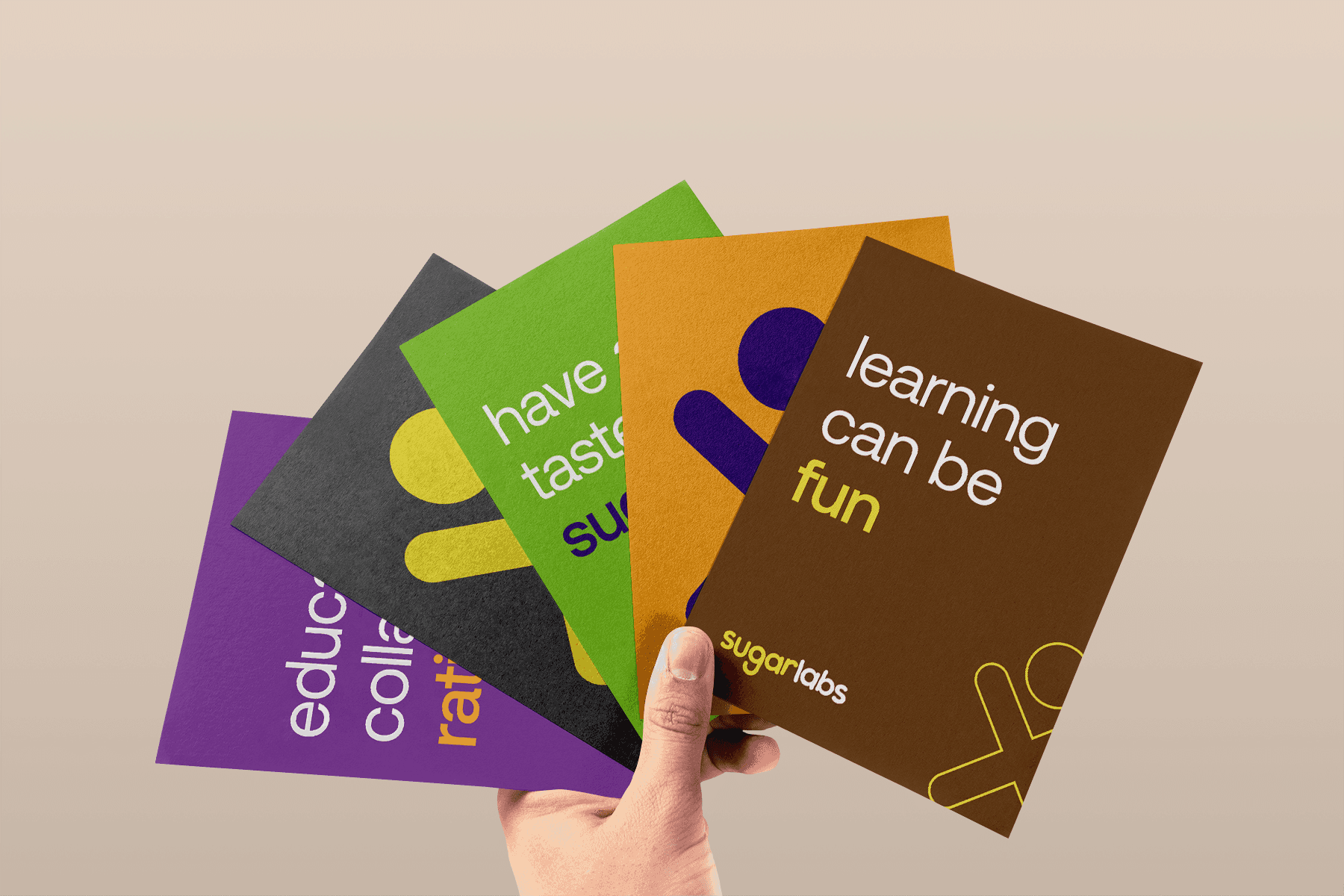
A new brand identity for Sugarlabs that captures a simple, minimal, modern, and evolving look.
In creating a new identity, there were considerations around 4 cardinal points for Sugarlabs - Kids, Education, Collaboration, and Community.

The refreshed identity is scalable and fun!

Client

Client

Sugarlabs

Sugarlabs

Service

Service

Brand Identity

Sector

Sector

Education

Education

Year

Year

2020

2020

Here comes the alt text

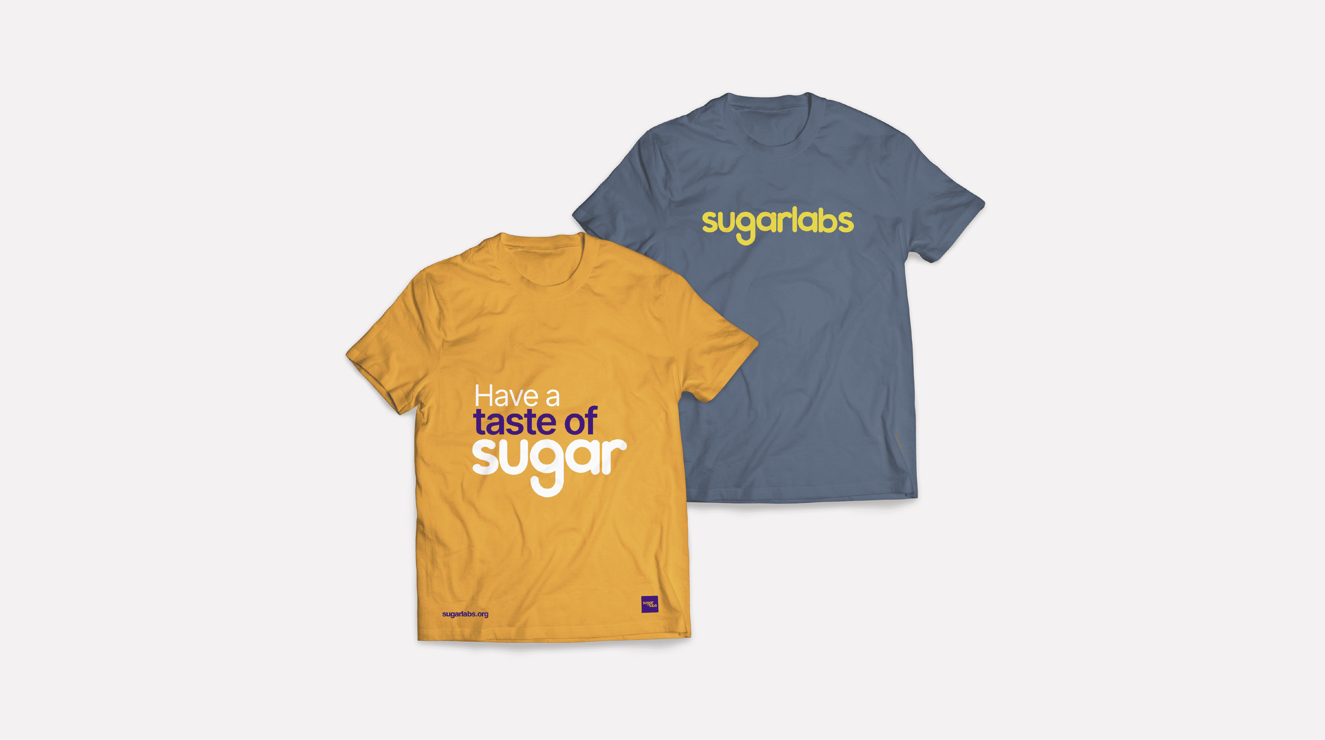
Introducing an air of freshness - vibrant and contemporary!

In this process, the unchanged objective of Sugarlabs came first - "Learning doesn’t have to be boring." Sugarlabs turns the average education process into a stellar learning experience. With this in mind, the color scheme was made to replicate the same vibrant, exciting, and playful impression that every child has while using the learning tools.

In this process, the unchanged objective of Sugarlabs came first - "Learning doesn’t have to be boring." Sugarlabs turns the average education process into a stellar learning experience. With this in mind, the color scheme was made to replicate the same vibrant, exciting, and playful impression that every child has while using the learning tools.

The new identity poses a vibrant and contemporary, flat, simple design and a logo that provides more leverage on scalability and accessibility

The new identity poses a vibrant and contemporary, flat, simple design and a logo that provides more leverage on scalability and accessibility

Credits

Credits